More New Layouts

 Love the simplicity of this one and the warm colors that make this layout so happy!

I had the prefect stamps in my collection to add a vintage feel to the base page.  


I know, I know, WORLD's cutest niece.  I wish the camera caught all the texture on the circles better.  All the edges have a worn/tattered edge that made it feel even more vintage. (sorry for the bad glare on the picture, camera wasn't cooperating)


This one wasn't 100% original, it was scrap-lifted off a page I saw on the internet but I can't find the source sorry!


HAD to post this one cause it's true, I'm her favorite Aunt!  Again, me going back to a grid design, love the simple lines (again crappy camera)


 Such a clean design filled with so much color (lots of scraps) but so fun!  I used rolls of scrap paper to create a border at the bottom, all tied and attached with bright blue ribbon..so fun!


I've been super busy the last few months putting together a scrapbook for my niece.  The book is all about her first year.  I gave it to my sister and brother in law for Christmas so I couldn't post all the pictures until now.  It will probably take me a few posts to get them all up.  Enjoy!

There weren't very many pictures of my sister in the picture with my niece (she is usually behind the camera)  so I was happy I got this one in there!  Loved the blocks of paper.


This was the end of her book, welcoming in 2011.  So cute!


I love, love, loved everything about this page.  The flocked paper (so not typical me but I loved it), the muted colors, the perfect pictures, everything!

My hand made embellishments were quite cute I do have to say!


Loving the bold colors that are muted at the same time.


 I liked how this one just seemed to create itself.  I'd add a little here, a little there and it all just worked together.  I loved the simple vintage look.


Here;s a closer look at the embellishments.


A simple 8x10 layout but so cute.  I had so much fun making the pennant banner..added a bit of whimsey I think.


This was one of my favorites, and not just because green is my favorite color.  Just look at it!  There is a faint blue watermark that says "memories" above each picture, you can sort of see it.


I actually got a few of our pages done in the process.  I got this pack of papers at the scrap expo this fall. I loved the bold colors!


After beating my own Dad at catching fish this spring, I had to document my moment!  Again, a square clean-lined layout with a rustic touch.


Our Mock-a-versary (anniversary after the actual day).  This layout feels so vintage and girly, so not me but I love it.  The juicy red color was so fun to work with in something other than a Christmas layout.


More to come later!

More eye-candy

This one was so simple but I was loving the colors.


 Again, same color scheme, different feel.


I wish you could really see the shimmery silver paper on this layout, its
so pretty.  The butterflies are all 3-D and add a pop to the layout.


I'm a sucker for square, clean-lined layouts and this one is no exception.


Each of the "pennant" papers have 3-D texture and pop off the page.  This was such a cute
picture that I didn't want to overwhelm it with a bunch of paper.  I think this small
touch of paper accents the picture nicely.

Another yummy layout + craft project

1st County Fair


This 1st County Fair layout was created fro my niece, Little A's, first year scrapbook.  The vintage coloring isn't bad lighting, it's really made in sepia colors.  I couldn't find all the perfect accessories and embellishments for this layout so I made my own.

I found free clipart on the web and altered it to fit my needs.

Little A lives in Wisconsin so I knew this embellishment of a Wisconsin sports team was perfect for the page.


Thirty Birdie
I made this gift card holder for my brother in law.  Mr M loves owls for some reason so when I saw this owl inspiration on a blog I knew I had to create one for his birthday.  It took a bit of time and some wasted paper t get the template for the gift card box just perfect but after that the fun began.  I loved picking out the scraps of patterned paper and finding all the circle punches I needed to complete the project.  This is how you give a 30-year old a gift in style!!!


New Layouts

So I just got a HUGE order of photos from Costco so I can show you the latest and greatest of what I've been working on.  I've decided to add a few 8x11 layouts to the mix of my 12x12 layouts.  I'm using these smaller sizes to tell stories that don't have a lot of pictures or no pictures at all or, to show small events of every-day life.  ENJOY

 This layout celebrated a dinner date we had with the in-laws.  I loved all the negative space and the fall colors.  I don't usually use so much patterned paper on a layout so it was fun to mix and match so many patterns for this one.

 Here is one of the 8x11 layouts I did.  This was just a few pictures and a quick blerb to explain about the event.  I love that it was just a simple little layout about a funny moment/story but it's still recorded for us to remember for years to come.


 Again, a small layout with barely any journaling but it celebrated such a fun moment of every-day life!


This one tells about a family tradition with my in-laws that we've carried on with our family.  I love that it tells a piece of history and celebrates it in the present.


 This was another fun lil moment spent with my Mom.  Again, a nice memory to be remembered for years.


As you can tell I've been really into negative space with layouts.  It's been a fun new twist on my regular layouts and adds some spice to our scrapbooks.


I loved that this featured 4x6 photos cropped and shown in a different way.  I normally have a really har time cropping my photos down (I've been scarred from thinking it was cool to cut individuals out of a picture in a bubble sort of way and stuck all over my locker and room in high school) - you loose a lot of what's happening but I love the way it turned out here.


This was the case where out of the whole night of pictures I only got one decent  picture to remember so I made it a smaller layout.  It was different because everything is printed from the computer except the picture...gives it a different feel.


I love the vintage feel of this.  Agin it's more of a family history/tradition piece with a current picture.  I enjoyed mixing the paper patterns from a few lines of paper and creating my own elements.  I think the stamped corners give it a real vintage feel.


 More family traditions.  I even included a copy of the vintage recipe that my family makes Lemon Meringue pie from.  This recipe was used (and stained) by my grandma....so full of memories.


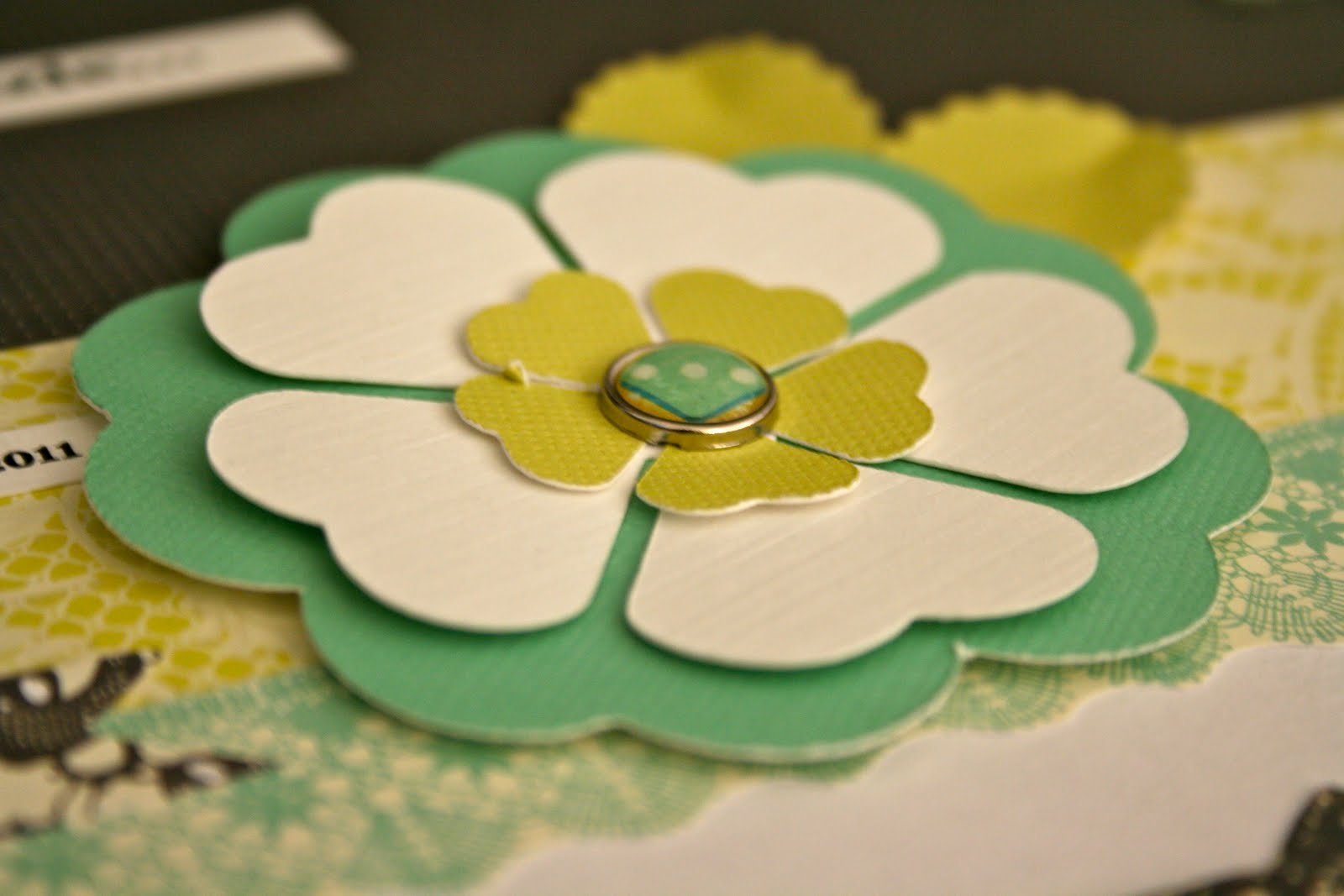
Now this one is pretty out-there for me.  Very frilly and feminine (looks like something my sister would tackle).  Somehow, even being away from my norm., I LOVE IT.  I love it so much I had to take close-ups to show all the dimensions and details that went into this layout

3-D chipboard mixed with fabric brads and layered paper flowers.

Loving the bright colors and vivid contrast.


The border of the picture was actually a piece of patterned paper I creatively cut and turned into a border.  So frilly and fun!


A complete absence of pattern paper makes this layout so simple and clean feeling.  In order to tell the story about finding our Mayan signs in Guatemala this Spring, I re-created our Mayan signs by tracing them, cutting them out and popping them on the page in 3-D.

Close-up of one of the hand-made Mayan signs.


Another new idea for our books, digital layouts.  I found that there were some pictures I just wanted to blow-up big and print a little text on the picture and include in our book.  This is our first-ever all digital layout.


Playing with more fun picture sizes from Costco...this 8x12 photo really makes a statement on this page


This was a layout that just seemed to fall all into place.  I fell in love with this one!  The photoshopped photos of my niece, Little A, were the perfect inspiration for a fun page.  I think it highlights the main focal point (the pictures) very well.


Another simple and clean block layout.  I really love the clean and simple lines of layouts like this one!


White paint was dry-brushed to the edges of this grey metallic (you can't see it in the picture but it is) paper.  I liked the dull, matte finish of the paint up against the shine of the paper...super high contrast, my favorite!