


This one tells about a family tradition with my in-laws that we've carried on with our family. I love that it tells a piece of history and celebrates it in the present.


As you can tell I've been really into negative space with layouts. It's been a fun new twist on my regular layouts and adds some spice to our scrapbooks.

I loved that this featured 4x6 photos cropped and shown in a different way. I normally have a really har time cropping my photos down (I've been scarred from thinking it was cool to cut individuals out of a picture in a bubble sort of way and stuck all over my locker and room in high school) - you loose a lot of what's happening but I love the way it turned out here.

This was the case where out of the whole night of pictures I only got one decent picture to remember so I made it a smaller layout. It was different because everything is printed from the computer except the picture...gives it a different feel.

I love the vintage feel of this. Agin it's more of a family history/tradition piece with a current picture. I enjoyed mixing the paper patterns from a few lines of paper and creating my own elements. I think the stamped corners give it a real vintage feel.


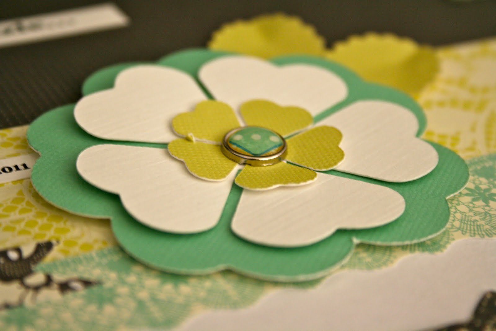
Now this one is pretty out-there for me. Very frilly and feminine (looks like something my sister would tackle). Somehow, even being away from my norm., I LOVE IT. I love it so much I had to take close-ups to show all the dimensions and details that went into this layout

3-D chipboard mixed with fabric brads and layered paper flowers.
Loving the bright colors and vivid contrast.


The border of the picture was actually a piece of patterned paper I creatively cut and turned into a border. So frilly and fun!

A complete absence of pattern paper makes this layout so simple and clean feeling. In order to tell the story about finding our Mayan signs in Guatemala this Spring, I re-created our Mayan signs by tracing them, cutting them out and popping them on the page in 3-D.

Close-up of one of the hand-made Mayan signs.

Another new idea for our books, digital layouts. I found that there were some pictures I just wanted to blow-up big and print a little text on the picture and include in our book. This is our first-ever all digital layout.

Playing with more fun picture sizes from Costco...this 8x12 photo really makes a statement on this page

This was a layout that just seemed to fall all into place. I fell in love with this one! The photoshopped photos of my niece, Little A, were the perfect inspiration for a fun page. I think it highlights the main focal point (the pictures) very well.

Another simple and clean block layout. I really love the clean and simple lines of layouts like this one!

White paint was dry-brushed to the edges of this grey metallic (you can't see it in the picture but it is) paper. I liked the dull, matte finish of the paint up against the shine of the paper...super high contrast, my favorite!

No comments:
Post a Comment